Professional Excel Charts
Create Excel Charts that get you noticed
Tired of making Excel reports that no one notices?
Imagine making Excel charts as powerful as those in The Economist and McKinsey, without getting stuck in slow, manual routines.
We get it – creating professional charts in Excel can eat up your time.
That’s exactly why our course focuses on MORE than creating charts that get noticed.
It teaches you formulas to make your reports dynamic so you can free up your valuable time for what matters.
Course Highlights:
- 8.5 hours of video lessons
- 60+ practice files & 50+ ready-to-use templates
- Quick Guide eBook on Excel Charts
- BONUS Cheat Sheets for fast learning
- LIFETIME Access so you never feel rushed
- English Closed Captions (created by a professional typist)
- Direct Support from our teaching assistants
- Digital Badge & Certificate of completion
Professionals from leading companies trust XelPlus


Excellent course with first-class presentation and ‘eureka’ moments throughout. After this course, I certainly will no longer have that ‘how did they do that?’ feeling anymore.


Leila never disappoints. Her style of teaching is second-to-none. This course lives up to its name: Business Charts.
Creating Engaging Charts in Excel Is Time-Consuming
If you lack the right techniques…
- You’ll struggle to make charts that explain your data clearly.
- Waste precious time on manual updates.
- Professional reports seem out of reach in a fast-paced business world.
Plus Excel keeps adding new features making it hard to keep up. There seem to be many powerful tools. But you’re stuck in the basics.
We don’t want that for you.
Creating professional Excel charts should be easy.
We designed this course so you can:
- Create Excel charts that exceed your manager’s expectations.
- Upgrade your skills with the latest Excel charting techniques.
- Master Excel formulas for dynamic, auto-updating charts.
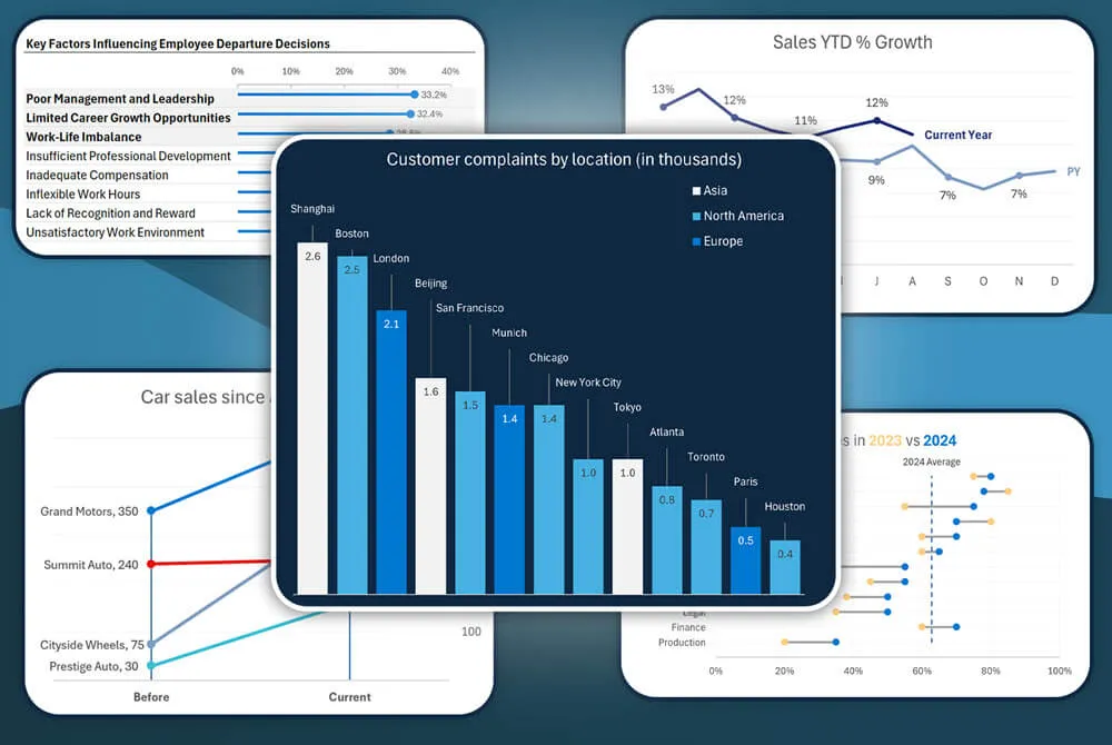
- Select the right chart type, ensuring your data stands out.
- Present complex data simply, just like the experts at McKinsey and The Economist.
These charts don’t only look great but also save you time. You get to focus on what really matters.


I work as a data analyst in the finance industry.
Before taking the course, I struggled with data visualization and storytelling. I found selecting the right visual challenging. I also had no idea how to go about highlighting data points that were noteworthy. I knew this was a separate skillset that I needed to develop, and that led me to enroll in this course.
I couldn’t be more satisfied with the content of this course.
I was truly blown away by the wealth of information and value it provided.
I am certainly better equipped to build insightful dashboards and reports after completing this course.
The immediate win for me is that I have gained the knowledge needed to generate better reports. I have no doubt that the impact of this course will be significant in my career.
Turn Data into Reports That Capture Every Colleague’s Attention
Join 400,000+ learners who’ve upgraded their Excel skills with us.
We know how challenging it can be to turn complex data into impactful charts in Excel.
Especially when your hard work goes unnoticed.
That’s why we designed our course to teach you quick methods for creating standout charts.
Visuals that are engaging, informative and at the same time minimalistic.
They’re rewarding to make. Rewarding to present. You’ll learn formulas to automate the making of your charts. So you don’t have to worry about adjusting your source data layout to fit your chart.
You’ll save a ton of time AND stand out for your skills.
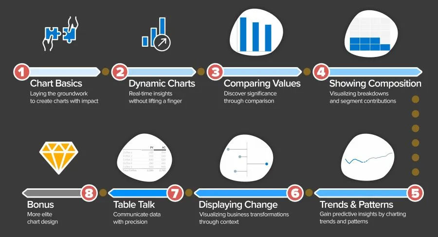
Your 8-Step Roadmap to Chart Mastery
If Excel has ever made you doubt your abilities, you’re not alone. Go through the steps in the course and soon you’ll find yourself mastering more than just charts.

From Our Students
Success Stories Across Professions


This course provides you with a solid base for creating outstanding charts in Excel that really make a difference in understanding your data. And not only that, it makes creating charts fun!
You really learn how to use Excel’s chart-building tools in a creative way.
The step-by-step approach from Leila is extremely helpful. It gives you the feeling: Yeah, I can do that! And when you do the exercises and challenges, it all really comes to life.
So before you know it, you have learned a lot reasonably effortlessly.
After participating in all of Leila’s courses over the years, that doesn’t come as a surprise because that’s what Leila’s courses are always guaranteed to give you.
This course is for you if you want to create more effective reports.
You will learn to tweak Excel charts to follow IBCS best practices, and I learned to love error bars.
Now I will be able to create reports that communicate more effectively.


As usual, Leila teaches in a captivating and easy-to-understand way. I got almost everything at first glance.
I found the most valuable insights in the powerful use of Error Bars and the creation of in-cell graphics; it’s a quick and elegant solution.
I can now build graphics more efficiently and get the audience better focused on the statement to be shared.


I used to hate creating visuals in excel, now I can’t wait!
I did wonder how much new there would be to learn, and I was blown away!
I never realized how much potential there was for making sophisticated business charts, way over and above the standard options. I am excited to try out some of these techniques in projects to come.
Turn Your Data into Engaging Stories
Stop wasting time with ineffective charts. Instead start making impactful visuals that get noticed.
But let’s face it, Excel can be tough and take up too much of your time.
We believe it should be easy to make charts that look good and tell a story. That’s why our course gives you all the shortcuts and support you need.

And there’s more to it than just looks.
Once you create an engaging chart, you want it to be responsive and automatically update. Because if not, your whole day gets swallowed up by trying to keep your charts and reports current.
Creating engaging AND self-updating charts is a skill few possess.
The best part?
In this course you’ll learn BOTH skills.
You’ll learn to make charts that update automatically with new data. No more wasting hours manually updating graphs for your monthly reports or presentations. Think of the extra time you’ll have for other work or to simply enjoy a well-deserved break!
Click the “Get Access” button below. Proceed to checkout and you’ll be directed to your learning hub. Next step? Start creating visually stimulating charts that tell a story. AND are simple to maintain.
Click this button to get started
🆕 Certified Achievement Badge

Earn Your Digital Badge Powered by Credly
After completing the course, you’ll receive a digital badge. It shows potential employers that you are skilled in creating impactful charts in Excel, including those that auto-update with new data, saving hours on manual edits.
This credential showcases your expertise to turn complex data sets into compelling, easy-to-understand visuals.
Our Digital Badges can easily be shared. You can add them to your LinkedIn profile, include them in your resume, or spread the word across your social networks – all it takes is a simple click.
Stand out to employers by clearly displaying your skills with a digital badge from XelPlus.
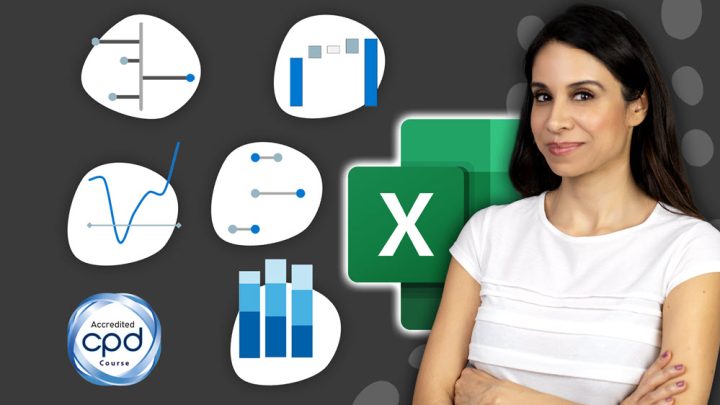
I’m Leila.
Your Instructor.
Each month, I hop on a special video call with the Microsoft team. This is one of the perks of being a Microsoft MVP. They fill us in on all the latest features coming down the pipeline. Excel has been changing a lot. I understand the frustration of keeping up with new Excel features.
Recognized by Forbes and others, my courses aim to boost your data analysis and visualization skills, focusing on automation to save time.
I relied heavily on Excel in my corporate days in finance, IT and project management. I’ve mastered creating powerful automations and turned challenges into strengths.
Join me to improve your Excel skills to the top level, without the manual hassle. It’ll be fun!


“But Leila, Why Learn Business Charts from You?”
You have plenty of options for learning about Excel Charts, so why enroll in our new course?
For starters, as with all our courses, you’ll benefit from our XelPlus 3-pillars of teaching.
Pillar 1 – We Speak Plain English
We don’t use jargon or “smart sounding” words when simple words will do. We start with the easy stuff to get you hooked. Then, you can go deeper.
We don’t scare you away by showing you the nerdy details right out of the gate.
Pillar 2 – We Give You Real World Examples
Business Charts are meant to help decision making and solve real world problems.
“What is this data trying to tell us?”
“What are we missing?”
“What should we do after this meeting?”
Some teachers are afraid to go there. They feel safe with theory.
Not us. We come from the trenches of industry.
We don’t shy away from real world examples. We lean into them.
Pillar 3 – We Show You the Big Picture
I’m the type who needs to see how everything fits together.
After all, nothing exists in a silo.
Some courses only show you how to create various chart types in Excel. Some only teach you how to transform raw data for visualization. Others show you how to create beautiful reports.
In our course we teach you both preparing the data and how to avoid manual updates. And yes, we show you how to create stunning visuals in Excel.
Our course teaches you not just to make great-looking charts and graphs but also to master Excel’s shortcuts and functions that speed up your work.
Here’s Your Learning Path
Check out the detailed curriculum below. Notice any topics that catch your eye?
Where would you like to start your learning journey?

Professional Excel Charts for Business Reports
Our course will take you through a step-by-step learning plan. From Excel chart basics to advanced dynamic charts and automation.
Wow your coworkers and managers with smart time-saving techniques.
This course includes:
8.5 hours of video content
Files for every video lesson
Downloadable chart templates
Challenges & Quizzes to test your skills
Quick Guide eBook on Excel charts
LIFETIME Access so you never feel rushed
BONUS Cheat Sheet for fast learning
Comment sections to ask questions and get answers from our friendly teaching assistants
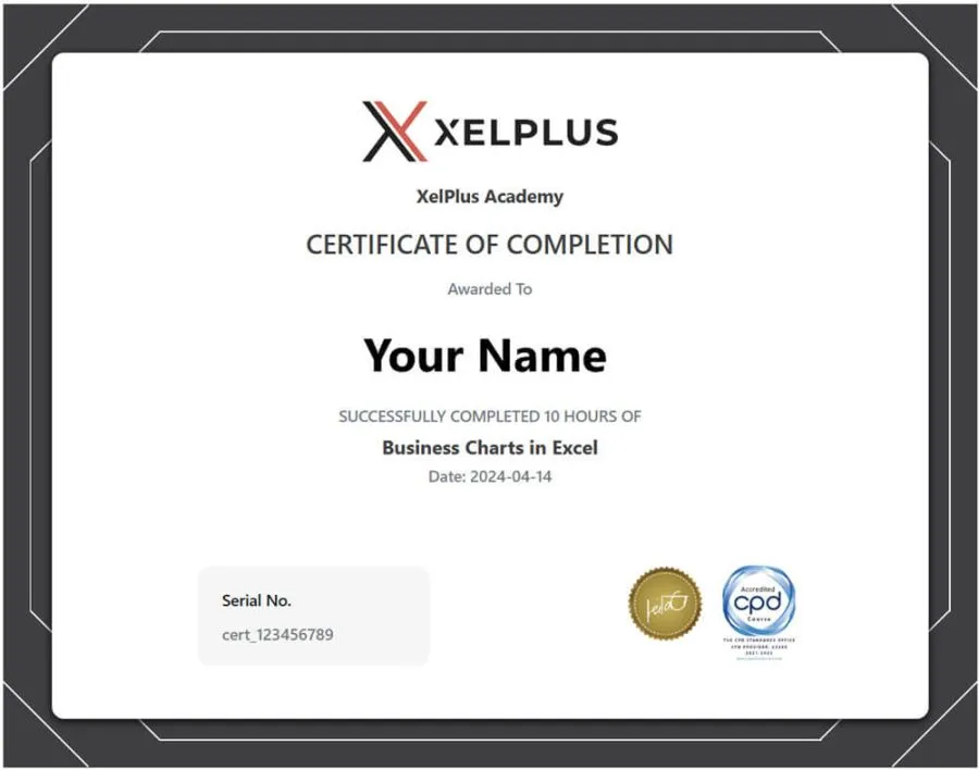
CPD Accredited Certificate of Completion
Digital Badge to post on LinkedIn
English Closed Captions (created by a professional typist)
Introduction
Section 1: Excel Chart Basics
Section 2: Mastering Dynamic Charts in Excel
Section 3: Comparing Values
Section 4: Showing Composition
Section 5: Understanding Trends and Patterns
Section 6: Displaying Change (Variance, Growth, Before/After)
Section 7: Presenting Tables in Excel
Bonus: More Elite Chart Design inspired by McKinsey & The Economist
Q&A Resource Hub
Wrapping Up
Ready to master reporting? Click this button to get started.
We’ll see you on the inside!
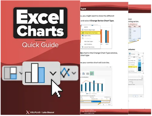
Included: Quick Guide eBook
Use our Quick Guide eBook to master all aspects of Excel charts.
You’ll get step-by-step instructions for over 20 essential charting skills.
It’s packed with expert tips. It covers changing settings, adjusting series, adding conditional formatting and so much more.
Every page brings you closer to becoming an Excel charting pro.

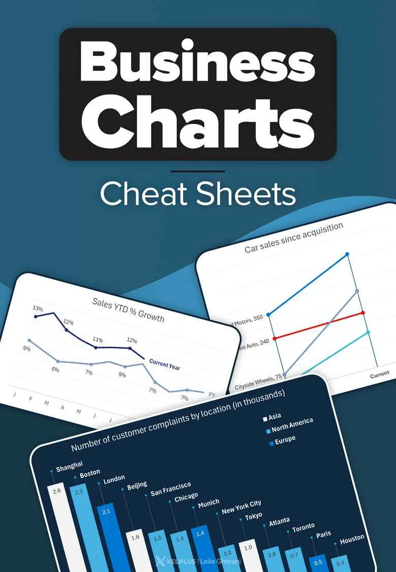
🎁 Bonus Cheat Sheets
Instantly recall what you’ve learned in the course.
Receiving cheat sheets with your course is great because they’re like quick guides.
These short references make using what you learn simple and fast.
And who doesn’t like cheat sheets 😊
(Note: 15 days after you enroll, you’ll gain automatic access to your cheat sheets.)

⏫ Lesson Transporter
Jump into the Topic You Need – Fast
As a Star Trek fan, I was always in awe of the transporter technology.
It blew my mind how Captain Kirk could locate a spot on a nearby planet, then instantly transport his team to that exact location.
I want your experience inside our new course to be just as instantaneous.
Thanks to a new tool we created here in our XelPlus “laboratory,” now, when you want to find a topic, you can do so instantly.
We’ve gone through every second of every lesson and pulled out the key words & topics. Then, we created an interactive agenda which allows you to quickly locate exactly what you’re looking for.
Once you find your topic, it’s simply a matter of saying “Beam me up!” (not actually required). Click the link and you’ll instantly be transported to the correct lesson and timestamp.
Mastering Excel charts has never been easier.
No more wasting hours searching. Find what you need, then get back to work.
🆕 Earn CPD Credits
I’m excited to announce that this Business Excel Charts course is CPD certified.
The Continuing Professional Development is a top global accreditation, trusted by companies and industries worldwide.
When you complete this course, you’ll get a special certificate with the official CPD stamp.
You will earn 10 CPD hours with the course.
If CPD credits can help in your career, this is not a course to skip.


📃 Get a Certificate of Completion
When you finish the Excel Business Charts course, you’ll get a certificate of completion.
You can send it to your boss, upload to LinkedIn, or just add it to your own person library of learning achievements.

Everything Included in Your Enrollment
It’s time to say goodbye to the stress of making Excel charts.
With our course, you can elevate your skills from the comfort of your home.
You’ll get:
- The confidence and rewards that come from having cutting-edge Excel skills
- In-depth knowledge with over 8 hours of video lessons
- Files to follow along with each video lesson
- 50+ ready-to-use business chart templates you can use right away
- Lifetime access: Learn on your schedule & without deadlines
- Our topic transporter to quickly navigate to the topic you need
- Quick Guide eBook to master all aspects of Excel charts
- A comment section to get your questions answered by our staff (how awesome is that?)
- Credits for CPD to enhance your resume
- English Captions by a professional typist
- Quizzes to track how well you understand the concepts
- Challenges to test your knowledge
- Bonus: Our collection of Cheat Sheets to keep at your desk.
You have everything in that list for just $249 (excluding taxes). And again, you never lose access. You can see what a great deal this is.
Ready for a change? Click the button below and enroll now.
Why bother with Excel Charts in the age of AI and Copilot?
Because here’s why:
- Personal touch: AI might be clever, but it doesn’t fully capture your project’s unique needs. Knowing how to create meaningful charts lets you highlight the key points well.
- Customization: You have full control over your chart designs in Excel. This is unlike AI tools, which have limits. This means you can tailor your presentations to fit exactly what you envision.
- Clear data presentation is a key skill for advancement. It stands out in any field, leading to recognition.
- And most importantly: The skill to simplify complex information is crucial in the future.
Being able to tell stories with data is how you make a name for yourself.
You’re Protected By Our Guarantee
You’ve gotten this far on the page and are thinking, “Hmm, should I really buy this thing?”
I get it. You’re busy and aren’t sure this is the best decision.
My advice? Give it a shot, and then if you later decide it wasn’t a good idea, take us up on our guarantee.
You have 14 days to decide if you want to stick with your purchase. If it’s not what you thought, send us a message and we’ll process your refund asap.
❓Frequently Asked Questions
Are there any requirements?
The course starts from Excel chart basics but it does require that you are familiar with the Excel app. If Excel still feels new to you, we recommend you start with our Excel Essentials course. It’ll get you all set up and confident to complete this course next.
When does the course start and finish?
It’s up to you! This course is self-paced, meaning you can start anytime and go at your own speed. Begin when you’re ready and finish on your schedule.
How long do I have access to the Excel business charts course?
You get access for the lifetime of the course, which means you can retake it for as long as it’s in existence – for FREE.
What if I am unhappy with the course?
We aim for your complete satisfaction. If you find the course isn’t right for you, just email us at info@xelplus.com within the first 14 days of your purchase for a full refund.
Got questions about the lessons?
We’ve got you covered. Unlike many online courses, XelPlus offers direct support from our dedicated teaching assistants.
Post your question in the course. Our team will give detailed answers to help you grasp each lesson better.
Have questions we haven’t covered?
Feel free to reach out to us at info@xelplus.com for any inquiries.