
Free Guide!
The ONE Critical Excel Skill You Need
This free Excel guide will help you to:
- Pinpoint the Excel skill you should work on now
- Understand how this skill can help you
- Find the optimal learning path to master this skill


Use Python in Excel to clean data, spot outliers, and create smarter charts – while mastering advanced analysis and knowing when Python adds value.


Your Perfect Starting Point in Excel. Most professionals pick up bad habits because they never get proper Excel training. This bundle fixes that – teaching you core skills, and must-know tools to make everything else in Excel so much easier.


This course gets you started in Power BI – Fast! Master Power BI and create interactive dashboards that make decision-making faster and easier.


With this tutorial, you will improve your chart design. I share a few different methods used for visualizing performance comparisons, deviations, as well as future estimated performance.


Learn how to get the unique count across rows using an array formula based on the MMULT and SUMPRODUCT functions.


Learn how to get the unique count across rows using an array formula based on the SUMPRODUCT and FREQUENCY functions.


Think of the OFFSET function as a GPS for your spreadsheet. You give it a starting point and then you tell it how many rows to go down, how many columns to move across, and what range you want returned. Master OFFSET with the help of this tutorial, which looks at calculating the average for the last six months in a dynamic way.
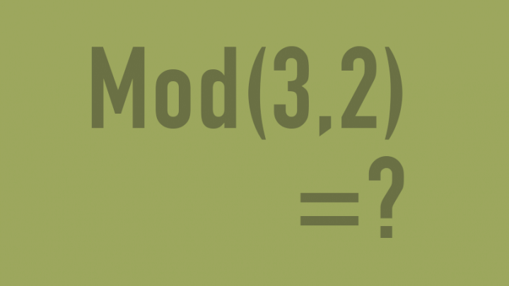

This tutorial explains the MOD function in simple terms and shows you three different practical cases. Use MOD to decide the ideal size of groupings, prepare data for quarterly reporting, and control the occurrences of data labels in charts.


Learn how to write dynamic YTD formulas in Excel using SUMPRODUCT, OFFSET & SUM functions, even when your data set goes over a few years, with each month occurring more than once.


Master one of the most useful functions in Excel – SUMPRODUCT. This tutorial explains how it works in easy steps. You’ll understand why you have to use a multiplication operator or a double negative, how to handle ‘and’ & ‘or’ conditions, and what to watch out for. You can test your knowledge with the attached exercise book.


A waterfall chart or a bridge chart is a way of visualizing your data that helps you understand how you got from one balance to another balance. They are very popular in business environment, especially for financial results or HR attrition statistics. Watch a couple of real-life examples to see how they work in practice.


Learn how to create a waterfall chart from scratch, using simple but unusual techniques. This version works with negative cumulative values and allows you to customize the data labels.


Excel 2016 introduced built-in waterfall charts. They are super easy to create, but not fully customizable. Learn how to set up and format a waterfall in Excel 2016 and see what its limitations are.


When you have too much to tell, don’t tell it all in one overcrowded chart. Instead create a panel chart: ONE chart that looks like mini charts placed beside each other. It’s often called small multiples and significantly improves readability. Learn how to set it up in Excel.


In this video tutorial, you will learn about the various tools you can find under the Formula Auditing group in Excel that can help you figure out the problem whenever you get stuck or your formula throws an error.
This free Excel guide will help you to: