


Download the free workbook 👉 HERE and follow along.
What is a Histogram?
A histogram is a type of chart that shows how often different values occur in your data. It’s useful for seeing the distribution of data at a glance.
Here’s an example to see how many employees there are in certain salary ranges.

How to Create an Excel Histogram
The histogram chart is a built-in chart option in Excel since Excel 2016.
Step 1: Prepare your Data
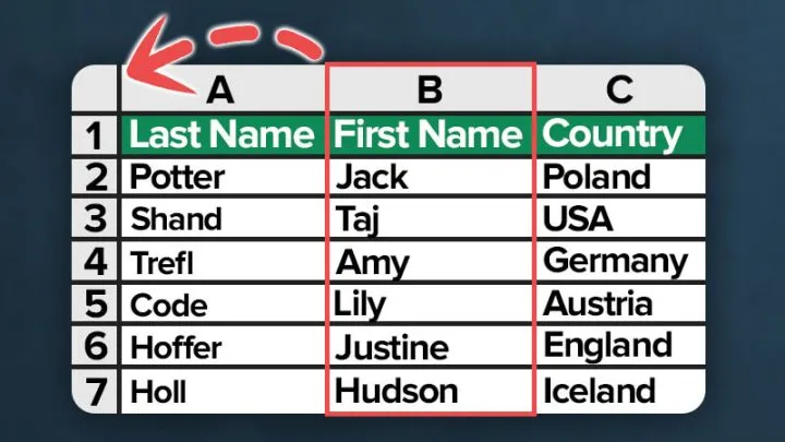
Suppose we have a dataset about personnel data with columns for names, entry date and the yearly salaries.

Step 2: Inserting a Histogram Chart
To create the Excel histogram chart, perform the following steps:
- Select Your Data: Highlight the data you want to use.
- Insert the Chart:
- Go to the Insert tab.
- Click on Insert Statistic Chart.
- Choose Histogram.

Featured Course
Professional Excel Charts for Business Reports

Step 3: Adjust the Histogram Bins
Adjusting the bins is important to ensure your histogram accurately represents your data.
Bins determine how your data is grouped and how detailed your histogram will be. Proper bin settings help you see patterns and trends more clearly.
- Right-click the Horizontal Axis: Select Format Axis.

Set Bin Options in Excel Histogram
- Select one of these options:
- By Category: Use this when your categories are text-based instead of numerical. The histogram will group the same categories and sum their values. For example, if you have data on different types of fruits sold, like apples, bananas, and oranges, use “By Category” to group and count each type.
- Automatic: The default setting. Excel calculates bin width using Scott’s normal reference rule. If you are unsure about setting bin width, leave it on automatic, and Excel will choose the best option for you.
- Bin Width: Define how big each bin should be. Enter a positive number to set the range for each bin. For example, if you have data on ages, you might set the bin width to 5. This means ages 0-4 will be in one bin, 5-9 in another, and so on.
- Number of Bins: Set the total number of bins you want. Excel will create the histogram with this many bins. Example: For a dataset of test scores, setting the number of bins to 10 could divide the scores into ten ranges.
- Add these if needed:
- Overflow Bin: Use this to group all values above a certain number into one bin. Example: If you have sales data and want to group all sales above $10,000 together, set the overflow bin to 10,000.
- Underflow Bin: Similar to the overflow bin, but for values below a certain number. Example: For survey results, if you want to group all responses below 50 into one bin, set the underflow bin to 50.
Setting the right bin options in your Excel histogram helps you visualize data accurately and identify trends. Experiment with these settings to see what works best for your data.

For our Excel Histogram example we’ll use these settings:
- Bin Width: Setting the bin width to 40,000 will create salary bins in increments of $40,000.
- Overflow Bin: We’ll capture all values above 200,000 in this bin.
- Underflow Bin: All salaries below 30,000 will be summarized in this bin.

Adjusting these settings helps you create a histogram that best represents your data, making it easier to analyze and interpret.

Customize Excel Histogram
Customizing your Excel histogram makes it easier to read and more visually appealing. Here are simple steps to personalize your chart:
Change Colors:
- Go to the Design tab.
- Select the bar colors you prefer to make your histogram stand out.
Add Data Labels:
- Show the frequency on the chart.
- Click on the bars, then select Add Data Labels from the menu.
Edit Title:
- Click on the chart title to change it.
- Enter a title that clearly describes your data.
Clean Up:
Remove the vertical axis and gridlines to make your chart cleaner.
- Right-click on the vertical axis and select Delete.
- Right-click on the gridlines and select Delete.

Adjust Number Formatting
If your data has large numbers, you can simplify the X-Axis labels by adjusting the number formatting.

Open Format Axis:
- Double-click the X-Axis to open the Format Axis panel.
Change Number Formatting:
- Go to the Number category.
- In the Format Code field, enter this code and press Add:
0,"K"- This code will round the numbers to the nearest thousand and add a “K” suffix.
- Example: If your data ranges from 21,000 to 261,000, it will display as 21K to 261K.


Explanation:
- Adding a single comma after the zero rounds the number to the nearest thousand.
- Adding two commas would round to the nearest million.
- The “K” suffix helps readers understand the true value of the axis.
Understanding Excel Histogram Bin Labels
Excel uses standard statistical notation for bin ranges on the horizontal axis.
- Brackets and Parentheses:
- Numbers in brackets [ ] are included in the bin.
- Numbers in parentheses ( ) are excluded from the bin.
Example:
- The label [10, 20] means both 10 and 20 are within the bin.
- The label (20, 40] means 20 is not within the bin, but 40 is.
Explanation:
- If your value is 20, it will be included in the bin [10, 20].
- It will not be included in the bin (20, 40].
Download the Workbook
Enhance your learning experience by downloading our chart template. Practice the techniques discussed in real-time and master pie charts in Excel with hands-on examples. Download the workbook here and start applying what you’ve learned directly in Excel.

Featured Bundle
Black Belt Excel Bundle


Leila Gharani
I’ve spent over 20 years helping businesses use data to improve their results. I've worked as an economist and a consultant. I spent 12 years in corporate roles across finance, operations, and IT—managing SAP and Oracle projects.
As a 7-time Microsoft MVP, I have deep knowledge of tools like Excel and Power BI.
I love making complex tech topics easy to understand. There’s nothing better than helping someone realize they can do it themselves. I’m always learning new things too and finding better ways to help others succeed.