


Organize
Arrange your categories into two groups whenever it makes sense.
Items should have a clear sequence. If you’re not sure, always put yourself in your readers’ shoes.
When you present ratios, these should come right after your variables that feed that ratio.

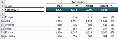
For presenting aggregated values, you should visually separate this from the rest of the data by either adding borders or colour.

Focus on data
Keep the focus on your data by making the border and grid lines very subtle, or simply using white space for the grids between the data.
Use very subtle fill colour to assist the reader with horizontal scanning of values for larger data tables.
Format appropriately
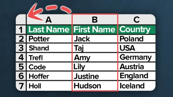
Numbers should generally be right-aligned. This way the readers can compare the values with more ease than when they are centred or left-aligned.

How you present large numbers, negative and positive values really depend on your country and the organisation you work for. Just do it the way your readers are used to seeing.
Text, on the other hand, should really be left-aligned. Here, we read from left to right. Sometimes, when the text is short, you might prefer to centre it, or right-aligned to fit your table better. Use your judgement here.

The font should also be easy to read, so use simple fonts such as Arial or Verdana.
Use emphasis carefully
If you’d like to bring the reader’s attention to a certain number, you can use colour, or make it bold.
If you’d like to bring attention to a certain section of the table, especially when you do comparisons between one scenario and another, such as Actual against Budget, we can use symbols.

Remember, don’t overemphasise and overdose on colour and symbols.
Keep your tables as simple as possible and bring attention only to areas that need attention most, which depends purely on the message that you want to communicate to your audience.

Leila Gharani
I’ve spent over 20 years helping businesses use data to improve their results. I've worked as an economist and a consultant. I spent 12 years in corporate roles across finance, operations, and IT—managing SAP and Oracle projects.
As a 7-time Microsoft MVP, I have deep knowledge of tools like Excel and Power BI.
I love making complex tech topics easy to understand. There’s nothing better than helping someone realize they can do it themselves. I’m always learning new things too and finding better ways to help others succeed.