


Download the workbook 👉 HERE and follow along.
What is a Pivot Table?
A Pivot Table in Excel is an easy way to summarize large amounts of data. It helps you find patterns and trends by organizing data in a clear and simple layout.
With a Pivot Table, you can arrange data in rows or columns and switch between these views easily. Excel calculates and shows summaries like totals, averages, or counts automatically.
Think of it as sorting puzzle pieces to see the whole picture.
Why Use a Pivot Table in Excel?
Pivot Tables are great for answering questions about your data and spotting patterns. For example:
Product Analysis:
- Total sales for each product.
- Total sales for all products.
- Product sales ranking from highest to lowest.
Customer Analysis:
- Total sales for each customer.
- Percentage of total sales for each customer.
Using a Pivot Table makes finding these answers quick and easy.
How to Create a Pivot Table in Excel
To create a Pivot Table, follow these steps:
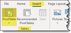
- Click on a cell that is part of your data set.
- Select Insert (tab) -> Tables (group) -> PivotTable.
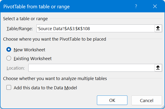
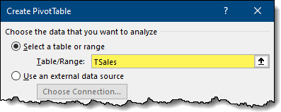
- In the Create PivotTable dialog box the selected data range will be displayed.
- Confirm the range and choose where you want the Pivot Table to appear.
- Click OK.
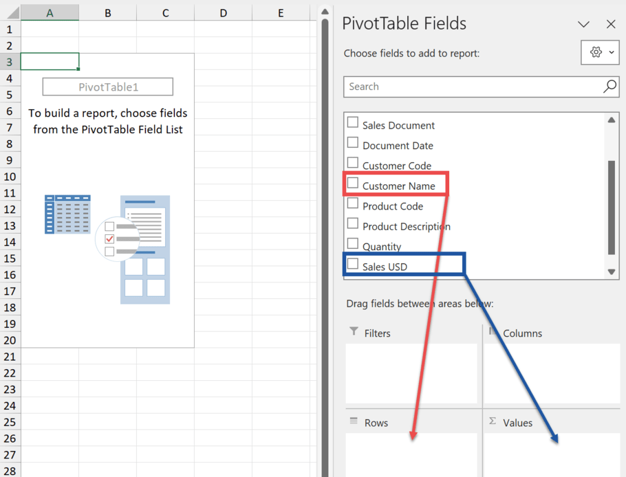
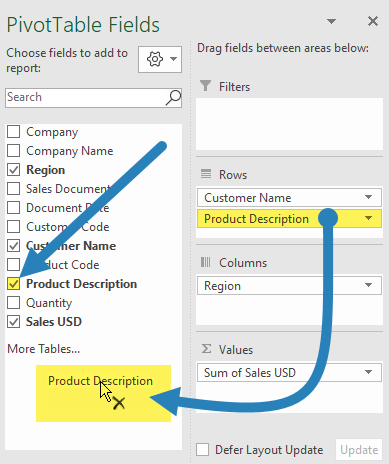
Adding Fields to a Pivot Table
Once you’ve created a Pivot Table, you’ll see two things:
- An empty Pivot Table on the left .
- A Pivot Table Fields List on the right. The Fields List allows you to add and organize data in your Pivot Table.
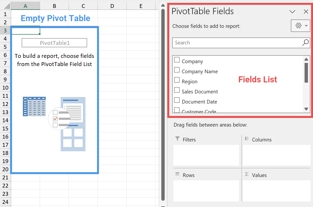
Using the Field List
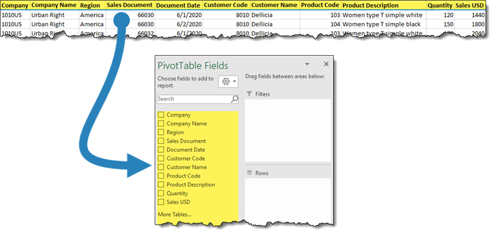
The PivotTable Fields List displays the headers from your source data.
To answer questions about your data, follow these steps:
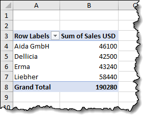
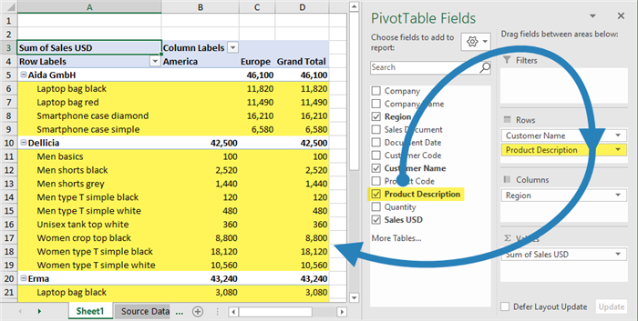
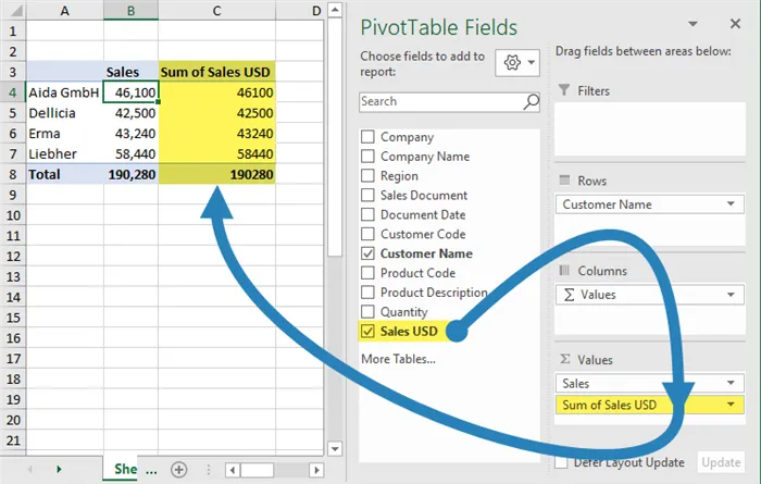
Add Rows:
- Click and hold the Customer Name entry in the Field List.
- Drag it to the Rows area.
Add Values:
- Click and hold the Sales USD entry in the Field List.
- Drag it to the Values area.
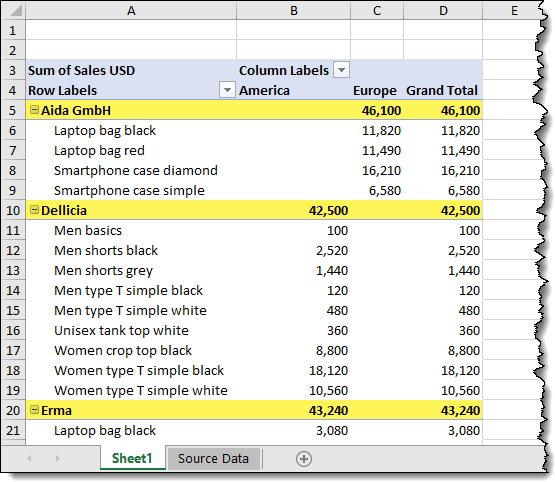
We are presented with the following Pivot Table.
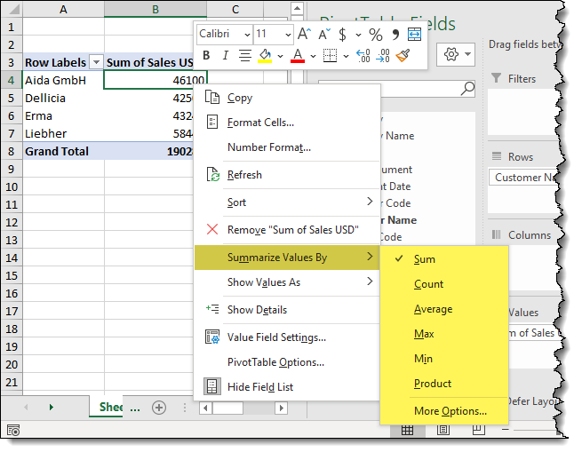
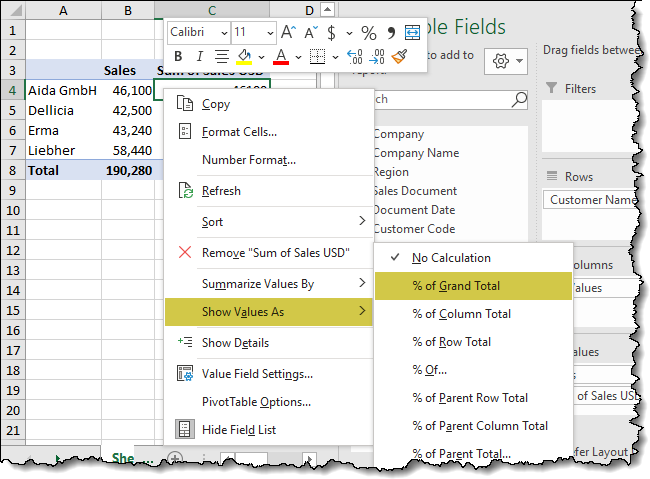
Change Summary Calculation
By default, the Pivot Table sums the sales. If you prefer a different summary method (like count or average), follow these steps:
- Right-click any sales number in the report.
- Choose “Summarize Values by…” and select the method you want.
Changing default aggregation.
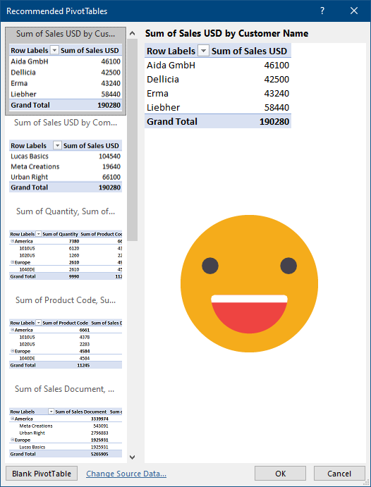
Using Recommended Pivot Tables
If you’re unsure how to start or want a quick way to explore your data, Excel’s Recommended PivotTables feature is a great tool.
Creating a Recommended PivotTable
- Select Your Data: Click on your data set.
- Open Recommended PivotTables:
- Go to the Insert tab.
- Click Tables, then Recommended PivotTables.

Excel will analyze your data and suggest several table designs. These suggestions are tailored to common questions you might have about your data.
Choosing a Suggested Table
- Review Suggestions: Look through the suggested table designs.
- Select a Table: Click on a table that fits your needs. This can provide you with an instant, useful summary of your data.
Starting from Scratch
If none of the suggested tables work for you, you can start with a blank PivotTable:
- Choose Blank PivotTable: In the lower-left corner, select Blank PivotTable.
- Add Fields Manually: Begin adding fields to your PivotTable as needed.
Using Recommended PivotTables can save you time and help you quickly find insights in your data. If needed, you can always customize or create a new table from scratch.
Featured Course
Excel Essentials for the Real World

Pivot Table Fields and Areas
You can place your Pivot Table fields in four different areas to change how your Pivot Table looks: Filters, Columns, Rows, and Values.
Filters
- Purpose: To filter the table by unique categories in the field.
- How to Use: Add a field to the Filters area, and a dropdown menu will appear in the upper-left corner above the Pivot Table.
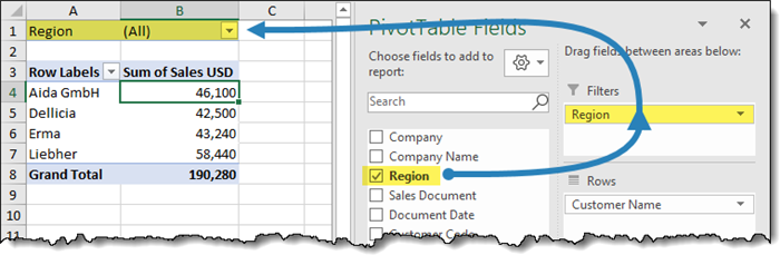
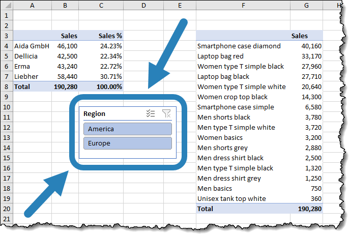
- Example: If you add the Region field to Filters, you can filter the table to only show values for specific regions like America or Europe.
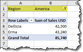
Columns
- Purpose: To create vertical columns using unique items from the field as headers.
- How to Use: Add a field to the Columns area to display each unique item as a column header.
- Example: Moving the Region field to Columns will show column labels for each region, such as America and Europe.
Rows
- Purpose: To create horizontal rows with unique items from the field as headers.
- How to Use: Add a field to the Rows area to display each unique item as a row header.
- Example: Adding the Product field to Rows will list each product as a separate row.
Value
- Purpose: To summarize data, typically numerical fields.
- How to Use: Add fields to the Values area to calculate sums, averages, counts, etc.
- Example: Adding Sales USD to Values will sum the sales by default. You can change this to count, average, or another summary method.
By understanding and using these four areas effectively, you can customize your Pivot Table to display your data in the most meaningful way.
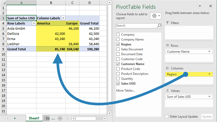
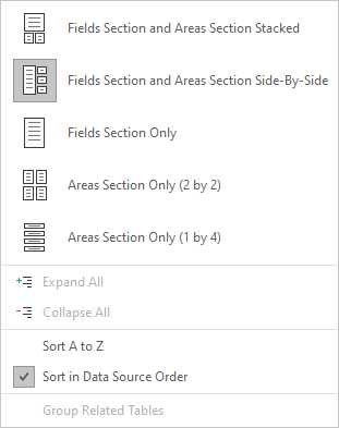
Pro Tip: Customizing Field Settings
You can customize the Field List by clicking the gear button to open the field settings.
You can change how the drag-and-drop zones are arranged, and also sort and search through your field names. Using a side-by-side layout usually gives you more space than the default stacked setup.
Working with Pivot Tables
Formatting the Results
You might notice the numbers in the pivot table don’t look right. If you want to show your numbers in a special way, like as currency or a percentage, right-click on any sales number and choose “Number Format…”. This takes you straight to the number formatting options.
❗Do NOT pick “Format Cells” from the menu. That only changes the cells you selected, not the whole report. Using “Number Format” means your chosen style applies to new data as it’s added, which doesn’t happen with “Format Cells”.

Creating a Multi-Level Report
If you want to make a report that shows a “parent” item broken down into “child” items, put the required field in the same zone as another field.
💡The order of fields in the zone decides which is the “parent” and which are the “child” items.
The hierarchy automatically creates subtotals for each parent-level item.
Collapsing and Expanding Hierarchies
Creating a parent/child relationship between fields adds “plus/minus” buttons next to each parent-level item.
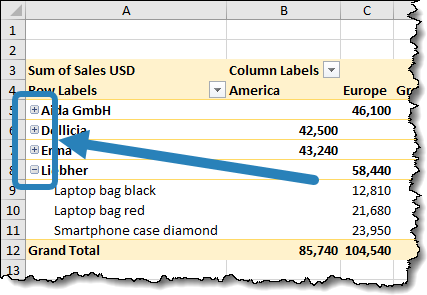
Hierarchical pivot table with only one row expanded to show “child” details.
These buttons enable you to show detailed information for child items by clicking “+”, and hide it by clicking “-“, leaving just the summary for parent-level items visible.
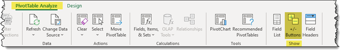
You can turn these buttons on or off by going to PivotTable Analyze > Show > +/- Buttons.
Location of the “+/- Buttons” toggle on the PivotTable Analyze tab.
Removing a Field from the Field List
If you decide you don’t want a field in a Field List zone anymore, you can drag it back to the main field list or just uncheck that field’s name in the main list.
Updating the Default Headings
The automatic pivot table headings are not pretty. “Row Labels” and “Column Labels” are not at all informative, and “Sum of …” is rather clunky. Definitely not suitable for presentation purposes.
Luckily, you can click inside the heading cell and type a more descriptive heading.
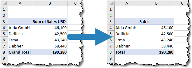
💡Pivot Tables don’t like when you name a heading that matches an existing heading. One trick is to add a space before or after the custom heading to avoid the conflict.
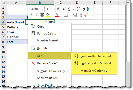
How to Sort a Pivot Table
The default sort order is alphabetic, based on the row labels, but report readers are typically interested in things like “top performers” or “fewest incidents”. We can easily sort the report by right-clicking an aggregation value and selecting Sort -> Sort Smallest to Largest or Sort Largest to Smallest.
Customizing the Pivot Table Layout and Other Settings
There are dozens of customizable options available to Pivot Tables. Some of the more widely used features on the Design tab include:
- Turning on/off subtotals
- Turning on/off grand totals
- Altering the layout of the table
- Adding/removing blank rows between parent-level rows
- Repeating parent-level labels to child-level rows
- Applying a pre-defined color scheme
- Coloring (highlighting) alternate rows/columns/headings
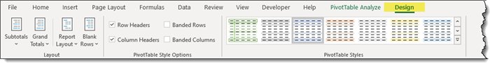
I encourage you to experiment with different combinations of cosmetic features to create visually interesting reports.
💡 The Design tab is contextual, meaning it only appears when you select a cell inside a pivot table.
Automatic Column Resize Based on Content
The Pivot Table will automatically resize the columns to ensure that no data is being visually truncated. This happens whenever you rearrange the fields in the Field List, sort the data, refresh, or perform any similar operation. And in most cases, this is a welcomed behavior.
However, if you have resized your columns to a size of your choosing, you will likely lose those dimensions on the following update.
To deactivate this automatic column resizing behavior, select PivotTable Analyze (tab) -> PivotTable (group) -> Options.
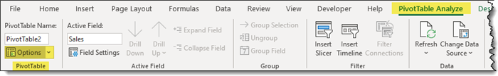
PivotTable Options in the PivotTable Analyze tab.
In the PivotTable Options dialog box, uncheck “Autofit column widths on update”.
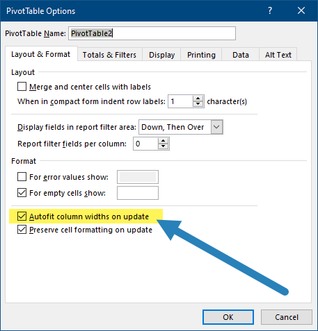
PivotTable Options dialog box.
Featured Course
Visually Effective Excel Dashboards

Pivot Table Tips & Tricks
Pivot Table Field List Not Showing
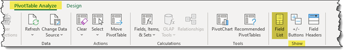
To show the Ribbon tabs and the Field List related to the Pivot Table, your cursor needs to be inside the Pivot Table area. You can also show or hide the Field List by clicking on the PivotTable Analyze tab, then going to Show and selecting Field List.
Clean your Source Data
Before creating a Pivot Table, make sure your data is set up correctly:
- The data needs to be in a table format; columns are categories and rows are transactions (records).
- Make sure there are no empty rows or columns.
- Avoid including subtotal or total rows in your data.
- Each column needs a unique title, and these titles should be in one cell each.
Making the Data Source Dynamic
To ensure your Pivot Table includes new data rows, convert your original data range into an official Excel Table. This way, the Pivot Table dynamically adjusts to changes in your data.
Steps to Create a Dynamic Data Source
Convert to Excel Table:
- Click on a cell inside your data range.
- Press Ctrl + T to open the Create Table dialog box.
- Click OK to confirm.
Name Your Table (Optional but Helpful):
- Go to the Table Design tab.
- Under Properties, rename your table from the default name (e.g., “Table1”) to something meaningful like “TSales”.
Create the Pivot Table
- Summarize with PivotTable:
- With your table selected, go to Table Design -> Tools (group) -> Summarize with PivotTable.
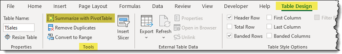
- Notice that the range selection now references the table name (e.g., “TSales”).
- In the Create PivotTable dialog box, click OK.
- In the Create PivotTable dialog box, click OK.
How to Add Percent of Total in Pivot Table
To find out what percentage of total sales each customer generated, follow these simple steps:
Add Sales USD Field Again:
- Add the Sales USD field a second time to the Values area, placing it below the original entry.
Show Values As Percentage:
- Right-click one of the values in the newly-added column.
- Select Show Values As -> % of Grand Total.
Take a moment to explore the Show Values As options for other useful calculations.
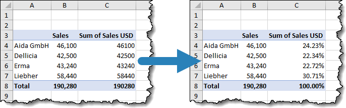
Sales amount shown in the pivot table as actual values and as percentage of grand total (before and after).
Rename the Column Header:
- Rename the new column header to something meaningful like “Percentage of Total Sales”.
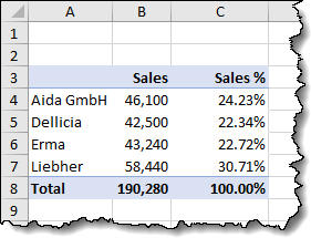
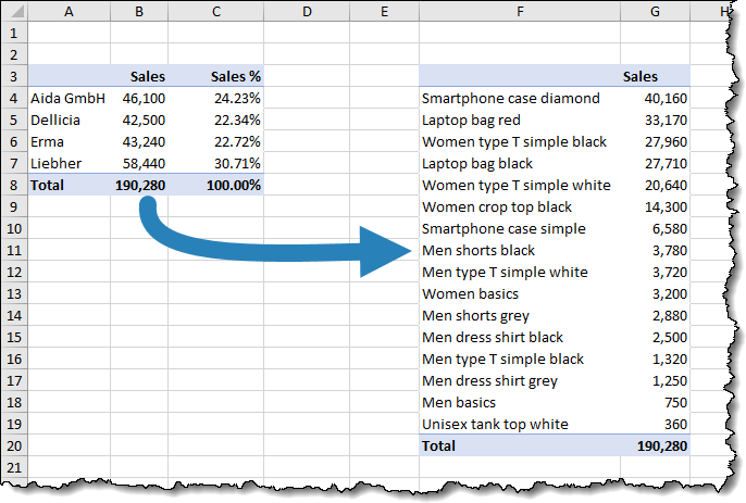
Now, your report shows the percentage of total sales for each customer. Next, you can use similar steps to analyze product data.
How to Copy a Pivot Table
Creating a second report by duplicating an existing Pivot Table is a useful trick. Here’s how you can do it:
- Highlight the original Pivot Table report.
- Press Ctrl + C on the keyboard.
- Click in an empty cell on a new sheet or to the side of an existing Pivot Table (ensure you leave enough blank columns to allow the original report to “grow” if needed.)
- Press Ctrl + V to paste a copy of the Pivot Table.
- Remove any unneeded field names from the drop zones and add the needed field names.
- If needed, sort the new Pivot Table by Values.
An advantage of copying an existing report is that all the cosmetic settings (color, number formatting, totals, etc…) are retained in the duplicate report.
If you want to move a pivot table, you will find a handy feature on the PivotTable Analyze tab in the Actions group. It allows you to specify the destination where you want to move the selected pivot table.

To permanently delete a pivot table, simply select the whole pivot table report (including filters, if any; you can use “Select” -> “Entire PivotTable” from the Actions group) and press Delete.
More Pivot Table Features to Explore
As you become advanced in the use of pivot tables, you will be able to create Calculated Fields – custom calculations that go beyond the standard aggregations available for the Values fields. You will work with custom groups, to create category classifications that may not be available in your data source.
This includes date groupings, which are applied automatically in Excel pivot tables whenever you add dates to your report, but which you can also customize to suit your needs.
Featured Course
Excel Data Modeling with Power Pivot & DAX

Filtering a Pivot Table with Slicers
If you’ve used Slicers you know how easy filtering is performed as opposed to old-school dropdown filters.
We can add slicers to out Pivot Tables to expedite the filtering process. Plus, it’s fun and looks cool.
The Main Advantage to Slicers
Unlike filters that are built into the Pivot Table, Slicers can filter by ANY category in the data set.
Where traditional filters can only filter by what is in the report, Slicers manipulate the “back end” data, which is then carried forward to the Pivot Table.
To add Slicers to Pivot Table reports:
- Click on any cell in a Pivot Table.
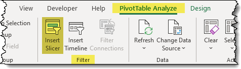
- Select PivotTable Analyze (tab) -> Filter (group) -> Insert Slicer.
- In the Insert Slicer dialog box, select the categories you wish to filter.
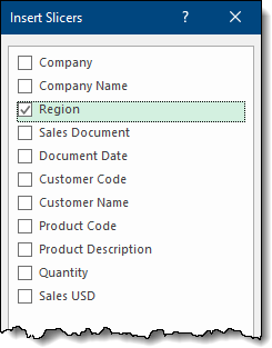
We are presented with a Slicer(s) for the item(s).
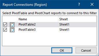
The slicer only affects the Pivot Table that was selected when the Slicer was created. If you need the Slicer to filter multiple Pivot Tables:
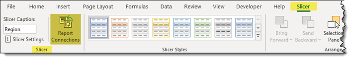
- Select the Slicer.
- Select Slicer (tab) -> Slicer (group) -> Report Connections.
- In the Report Connections dialog box, select as many (or as few) Pivot Tables you need to achieve the desired behavior.
How to Refresh a Pivot Table
When the underlying data changes (additions, deletions, or modifications), you will need to “refresh” the report to reflect the changed data.
There are many ways to refresh the Pivot Table report.
- Right-click on the Pivot Table report and select Refresh.
- Select PivotTable Analyze (tab) -> Data (group) -> Refresh.
- Select Data (tab) -> Queries & Connections (group) -> Refresh All.
- Use the shortcut: Ctrl + Alt + F5.
Next time you’ll want to easily analyze data, you will know how to create a pivot table in Excel and how to make the most of it.
Looking to take your Pivot Tables skills in Excel to the next level? We’ve got you covered! Dive into our easy-to-follow article for some expert tips and tricks. Click here to learn more.
Download the Workbook
Enhance your learning experience by downloading our workbook. Practice the techniques discussed in real-time and master Pivot Tables in Excel with hands-on examples. Download the workbook here and start applying what you’ve learned directly in Excel.

Featured Bundle
Black Belt Excel Bundle


Leila Gharani
I’ve spent over 20 years helping businesses use data to improve their results. I've worked as an economist and a consultant. I spent 12 years in corporate roles across finance, operations, and IT—managing SAP and Oracle projects.
As a 7-time Microsoft MVP, I have deep knowledge of tools like Excel and Power BI.
I love making complex tech topics easy to understand. There’s nothing better than helping someone realize they can do it themselves. I’m always learning new things too and finding better ways to help others succeed.