


What is a Gantt Chart
Gantt charts are key in helping teams see how a project will go, step by step. Imagine a chart where you list what you need to do on one side and put times across the top. Each job gets a bar that shows when it starts, how long it should take, and when it ends.
This helps those running the project see the order of tasks, how long each one should take, and if some tasks might clash. It makes planning deadlines easier and helps spot any timing issues before they become problems.
Excel’s grid format makes it perfect for creating Gantt charts. It makes creating and tracking project timelines simple.
How To Make a Gantt Chart in Excel
This step-by-step tutorial will show you how to make professional Gantt charts in Excel starting with the very basics.
This will be our end result:

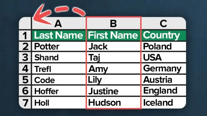
Step 1: Set Up Your Project List
First, fill in your project details into the Excel sheet as if you’re making a simple list. Start with your project tasks in the leftmost column, one task per row. For each task, you’ll need to add:
- The start date: When the task begins.
- Duration (in working days): The total time needed to complete the task.

Featured Course
Professional Excel Charts for Business Reports

Step 2: Account for Weekends and Holidays in Your End Date
After setting your start date and task duration, the next step is to calculate the end date for each task, making sure to skip over weekends and any holidays your project will observe. For holidays, you’ll list them separately.

To figure out the end date for each task without counting weekends, we’ll use Excel’s WORKDAY function. This function skips weekends for you. For example, for the task ‘Design completed’, the formula in cell G3 is:
=WORKDAY(B3, C3, $E$3:$E$12)This formula starts with your task’s start date, adds the number of workdays you’ve set for the task, and avoids any dates listed as holidays. Once you’ve got it set up for the first task, you can copy this formula to the rest of your tasks easily.

💡 To enhance your scheduling skills in Excel, check out our detailed article on the WORKDAY and NETWORKDAYS functions 👉 HERE.
Next, We’ll figure out how many days each task will take by subtracting the start date from the end date. For instance, for the ‘Design completed’ task, subtract the start date (B3) from the end date (G3).
I3 = G3 - B3Copy this for all tasks.

The last step is to simply add a new column to number the tasks in sequence (task number):

💡 To automatically number the tasks, you can also use the ROW function in Excel.
Step 3: Make the Gantt Chart in Excel
Let’s turn our project timeline into a Gantt chart using a Scatter Plot, which offers several advantages over the typical bar chart approach:
- No Extra Calculations Required: There’s no need for additional calculations for the base of each stacked bar.
- Customizable Display: You can make the chart transparent and position it precisely, using Excel’s conditional formatting to enhance visibility and organization.
- Flexible Labeling and Data Integration: Utilize Excel cells directly for labels and adding extra information, providing greater flexibility and customization.
First, highlight the start dates in column B, hold down the Ctrl-key and highlight the task numbers in column J.

Then in the Excel ribbon, click on Insert and then select Scatter.

Copy the task names and paste them next to the chart. Then, match each task with its dot on the scatter plot.

The chart now shows Task #1 at the bottom. But, you want it at the top.
To fix this, double-click the Y-axis (0 to 10). This opens the Axis Options. Select ‘Values in Reverse Order‘ to invert the order.


Step 4: Format the Gantt Chart
Next, to blend the scatter plot into the spreadsheet, remove the chart’s fill and outline: Click on the chart, go to Format, select Shape Outline, and choose No Outline. Then remove the fill by selecting Fill, and choose No Fill.
To extend the visual consistency across the row onto the chart, highlight the cells. Then, add a light grey border to their outlines.

Now let’s improve the formatting of the Gantt chart:
- Align the tasks on the left with the dots in the chart and remove the Y-axis to simplify the view.
- Expand the chart horizontally along the X-axis to make more room.
- Remove both horizontal and vertical gridlines from the chart

- Simplify the X-axis by removing the year to avoid clutter. Double-click the X-Axis to go to the Axis options, choose Number, and untick ‘Link to Source’ formatting. Change the Format Code to show only the month and day, like this: m/d. Then click on Add to confirm.


With the tasks positioned for their start dates, we can use the error bars technique to clearly show the duration of each task.
Step 5: Add Error Bars to Represent Task Duration
Select the scatter plot series and add error bars.


Delete the vertical error bars:

Click on the horizontal error bars, set the Direction to ‘Plus’, and for End Style choose ‘No Cap’.

To set the length of each error bar, select ‘Custom’ and then click on ‘Specify Value’.
Use the data from your ‘Total days’ column for the Positive Error Value.

This will display the task durations on the chart as lines of varying lengths.

Step 6: Convert Lines to Bars
Change the color of the error bars to a lighter gray and increase their width in the Formatting Options.

Adjust the positioning to align the bars with the corresponding tasks.
💡 To fine-tune the chart’s position, hold Ctrl and click the chart edge, then use the arrow keys to adjust.
Hide the original scatter points by selecting them and choosing ‘No fill’ and ‘No line’ in the Marker Options.

This setup now clearly shows the tasks, their start dates, and durations.

As a final step, let’s making your chart even more informative. We’ll add the Number of Working Days to Each Task.
And here is your final result:

This method quickly integrates the project’s timeline into your Excel Gantt Chart.
Download the Gantt Chart Excel Template
Download our free Excel template 👉 HERE.
Customize it to fit your needs and streamline your project planning in just seconds!

Featured Bundle
Black Belt Excel Bundle


Leila Gharani
I’ve spent over 20 years helping businesses use data to improve their results. I've worked as an economist and a consultant. I spent 12 years in corporate roles across finance, operations, and IT—managing SAP and Oracle projects.
As a 7-time Microsoft MVP, I have deep knowledge of tools like Excel and Power BI.
I love making complex tech topics easy to understand. There’s nothing better than helping someone realize they can do it themselves. I’m always learning new things too and finding better ways to help others succeed.